Tuesday, January 26, 2010

William Krisel's First Published Project: The Dan Palmer Deck at Schindler's Falk Apartments, Silverlake, 1949 and the First Palmer & Krisel Office

I was out last weekend checking out an open house for Schindler's Westby House in Silverlake. While in the neighborhood I decided to do some "archeological work" at Schindler's Falk Apartments at 3631 Carnation Ave. down the street.

Falk Apartments, Silverlake, R. M. Schindler, 1939. Photo by John Crosse.

Architect William Krisel's "roots" so to speak, as a professional designer began while still in school at USC in 1949. Krisel apprenticed with noted architect/interior designer Paul Laszlo in the summer of 1946 where the focus was on residential design and residential and commercial interiors. The next three summers and after school during the school year Krisel worked in the office of Victor Gruen on office buildings and commercial work where he met future partner Dan Palmer. Dan had moved to California in 1947 with wife Doris and moved into R. M. Schindler's Falk Apartments commissioned by S. T. and Pauline Falk (Dan's aunt) in 1939.

Falk Apartments, 3631 Carnation Ave., Silver Lake, R. M. Schindler, architect. Julius Shulman Photography Archive, J. Paul Getty Research Institute. From USC Digital Archive. 

Patio before Palmer & Krisel pergola and deck improvements, Falk Apartments, 3631 Carnation Ave., Silver Lake, R. M. Schindler, architect. Julius Shulman Photography Archive, J. Paul Getty Research Institute. From USC Digital Archive. 
 
 
Lane Publishing, 1953. Jerry Anson photo. Details by William Krisel. Scanned from my collection.

Krisel's first professional job was to design the pergola and deck improvements seen in the Sunset publication above and my photo below in the spring of 1949 during his last semester at USC. The project was published in 1951 in Sunset magazine and in 1953 was anthologized in "Sunset Ideas for Hillside Homes." Palmer's aunt Pauline allowed the pergola to be built and even paid for the construction. It is amazing that the pergola is still in such good shape 60 years later.

 Palmer pergola designed by William Krisel with Schindleresque details. Photo by John Crosse.

While conducting an Oral History interview with Krisel I learned that his first office in 1950 was literally on the ground floor, i.e., in a dirt-floored, glorified crawl space below the apartments (see below).

First Palmer & Krisel office below the Falk Apartments. Photo by John Crosse.

Dungeon life was short-lived as when Bill's father heard about it he said "You can't be an architect and be in a basement. You'll never get a client that way." He fronted the boys $60.00 for their first month's rent for a real office at 1072 Gayley Ave. in Westwood and they never looked back.

For much more on Bill Krisel's early years see my "William Krisel and George Alexander in Hollywood."

Thursday, January 14, 2010

Pellisimo!! Red Building Rising: Cesar Pelli's Missing Link: The 40-Year Saga of the Pacific Design Center

An appropriately colored crane for Pelli's Red Building. Photo by John Crosse, January 2010. 

While attending the on-going exhibition "Folly - The View From Nowhere" (see my January 13, 2010 post) recently at MOCA Pacific Design Center I happened to notice the above gigantic red crane looming over the construction site for the long-awaited missing piece of Cesar Pelli's grand vision for the Pacific Design Center. With any luck, the Red Building, Phase III of a 40-year effort, should be completed sometime in 2011. Phase I, the beloved "Blue Whale" was completed in 1975 after a five-year design and construction period. Based on the state of the current economy the Red Building may take as long as the Blue Whale did, i.e. nine years, to become fully leased.

I attended the gala groundbreaking ceremony for the Red Building on March 29, 2007 during the annual Westweek festivities. The official program below commemorated the event.

 
 Covers of the Red Building Groundbreaking brochure. (from my collection).

 
Interior of the Red Building Groundbreaking brochure. Note Pelli's signature. (from my collection).

 March 29, 2007 issue of the L.A. Times. p. C1. (from my collection).

The above article talks about a booming economy and the timing finally being right to build the final phase of the PDC. One can't help but wonder if the project would have gone forward in light of the economic and financial events of the past year-and-a-half.

March 29, 2007 issue of the L.A. Times. p. C2. (from my collection).

March 30, 2007 issue of the L.A. Times. p. C2. (from my collection).
 Design Book Review 12, Spring 1987 issue commemorating the groundbreaking for the Green Building. (from my collection).

Interiors, February 1987 issue with Paula Jackson cover story commemorating the groundbreaking for the Green Building. Hans Neleman photo. (from my collection).

Site plan with all three phases complete from the above cover story. (from my collection). 

Quoting Pelli from the above feature cover story "The first building was rigorously conceived as a unique, free-standing architectural object sitting on the ground and clad in brightly colored ceramic glass. I never imagined for a moment that I would ultimately have to re-think the relationships between the "Blue Whale," the site and the community around it. But that is exactly what happened. To 'undo' that which was 'finished' has been an extraordinarily creative experience but I think we've made the site much richer as a result. Each of the two additional phases will have its own character, will be seen as an independent, individual fragment coming together in a beautiful and an exciting complex of forms."   


 January 1987 issue of Progressive Architecture, 34th Annual P/A Award for the Pacific Design Center Expansion. Model by Model Concepts. (from my collection).
 
 March 1989 cover story "Green Phase" by John Morris Dixon describes the completion of the Green Building. Photo by Aker Photography. (from my collection).

 
Back cover of "Cesar Pelli" by John Pastier, published by Whitney, 1980. (from my collection). 

"Cesar Pelli" author John Pastier states "Here (the Blue Whale) is a speculative undertaking that manages to outshine the city's recent public monuments, but it's quirky form and sharp break in scale have puzzled and even outraged many Los Angeles residents. It's contextual effects may be honestly debated today (late 1970s), but in time the sea will rise, surely enough to make it seem more like a dolphin." How prescient he was! 

The below two publications are indicative of the big splash made by the "Blue Whale" on the L.A. architectural scene upon completion in late 1975.

Left: A View of California Architecture: 1960-1976 by David Gebhard and Susan King, San Francisco Museum of Modern Art, 1976. (Exhibition catalog from my collection). Right: Cover story, L.A. Architect, December, 1975 (from my collection). 

From the November 7, 1971 issue of the L.A. Times.

Above is the earlist mention of the Pacific Design Center project in the L.A. Times.

Wednesday, January 13, 2010

"Folly - The View from Nowhere" at MOCA Pacific Design Center

Exhibition poster.

Folly - The View from Nowhere,  curated by Los Angeles–based architects Frank Escher and Ravi GuneWardena, and organized by MOCA Curator Philipp Kaiser surveys 100 architectural follies from around the world in an installation at MOCA Pacific Design Center. The exhibition's piece d' resistance is "Folly I" designed by Escher GuneWardena and built on-site by d + con, Design Plus Construction, General Contractors, Los Angeles. (see below).


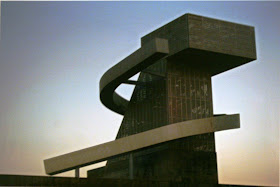
Installation views of "Folly I" and overview of the Los Angeles basin from top of "Folly I". Photos by John Crosse.


Webster's defines folly as "an often extravagant picturesque building erected to suit a fanciful taste." The exhibition provides a thoughtful, comparative overview of the evolution and definition of these structures which started as inconsequential, decorative out-buildings mimicking Greek or Roman temples on the grounds of great English estates serving little or hidden purpose. As you travel through the exhibition you sense the broadening of the definition to include whimsical fantasies, unrealized concepts and more utile built structures, albeit, all still with a link to fancifulness and eccentricity. The more modern versions such as Le Corbusier's Philips Pavilion at the 1958 Brussels World's Fair, Coop Himmelblau's Central Los Angeles Area High School No. 9 Tower, and disguises for oil platforms in Long Beach Harbor designed by Linesch & Reynolds were some of my personal favorites. (see below).


 "Fantasy Islands: Landscaping Long Beach's Oil Platforms" exhibition catalog, University Art Museum, UC Santa Barbara, 11-3--2005 - 04-30-2006 and University Art Museum, Cal-State Long Beach, 08-29-2006 - 10-15-2006 http://www.csulb.edu/org/uam/pages/Exhibitions/Past/Fantasy%20Islands/fantasy_islands.html. (from my collection).

Linesch & Reynolds, “Island Alfa, Design Concept Study”, 1966. Rendering by Gary Seagroves. From the above catalog.
© 2006 The Regents of the University of California, University Art Museum, UCSB.

The 100 images, ranging from the Pantheon at Stourhead in Wiltshire, England, and Lucy the Elephant in Margate, N.J., to Pelli’s pavilion at Pacific Design Center in which the exhibition resides, revolve around the above site-specific folly of Escher GuneWardena’s own design. Having recently spent a lot of time researching Frank Gehry's exhibition work I entered the show fully expecting to see his conceptual "Prison" folly and was not disappointed. This was my vote for "Best of Show" in the unbuilt category.

Image on display at the exhibition courtesy of Frank Gehry Partners.

"The Prison" resulted from an invitation to participate in the exhibition "Follies: Architecture for the Late-Twentieth-Century Landscape" at the Leo Castelli Gallery in New York and James Corcoran Gallery in Los Angeles in 1983. The exhibition also included conceptual follies by Peter Cook, Emilio Ambasz, Arata Isozaki, Bernard Tschumi, Peter Eisenman and others among the more esoteric architects of that period. Review of the catalog (see below) is highly recommended as an accompaniment to the show.

Published by Rizzoli, 1983. (from my collection).

In his introductory essay "History of the Folly" Anthony Vidler describes the System of the Folly as follows:

"The folly is defined in the 18th century, elaborated in the 19th century and dissolved in the 20th century has operated according to the following premises:
  1. It has referred back to, or nostalgically alluded to a short history of modern follies: it is a solopsism.
  2. It has acted as the asylum for the forbidden, for the repressed, for the denied and the absolutely impossible.
  3. It has, perversely, exhibitied a discipline, a logic, a reason in itself, which because withdrawn from the world, remains in the sense pure.
The folly, then, as a most unwelcoming thing, has become the most sought-after guest: it is at best sublime and at worst, frivolous, but still, despite the current tendency for imitating follies as if they were architecture, such extravagance demands attention. Follies have their place and their role, but only as long as reason is desired."

Click on the image above to view exhibition curator B. J. Archer's interpretation of Gehry's "Prison."

Published by Rizzoli, 1981. (Scan from my collection).

Gehry's concept for the fish evolved out of an earlier collaborative fancy with Richard Serra for the "Collaborations: Artists and Architects" exhibition at the Architectural League of New York in 1981. (see above). They created a hypothetical bridge in New York City connecting the Chrysler Building to the Twin Towers of the World Trade Center, both ends tethered by pylons. Serra's pylon was a steel mast rising from the East River while Gehry's was a fish seemingly flying out of the Hudson. (see below).

 
From "The Architecture of Frank Gehry", 1986, Rizzoli. Steve Tomko photo. (from my collection).

Gehry's fish projects provide enough "folly" to encompass an exhibition all their own, not to begin to mention most of his designed 1989 Pritzker Prize-winning ouvre. The 1992 sculpture for the Barcelona Olympics seen at the following link being just one of numerous examples. http://www.pbs.org/wnet/americanmasters/database/gehry_pop/fish.html. Personal favorites from his other works such as his 2008 temporary Serpentine Pavilion in London (see below), the 1987 Winton Guest House in Wayzata, Minnesota, the 1984 "Lifeguard Tower" for the Norton Residence in Venice, and the Lockheed F-104 appended to the 1983 California Aerospace Museum in Los Angeles all evoke in my mind the fancifulness that a true folly should possess.

Published by Serpentine Gallery, 2008. (from my collection). http://www.serpentinegallery.org/2008/03/forthcoming_summer_2008serpent.html

One folly that I thought should have been included but was not was co-curator Frank Escher's concept for a cave-like library chiseled out of the bedrock beneath the Elrod House in Palm Springs. It would have been the only underground folly in the exhibit. This idea was presented as part of "Engaging Lautner's Built Legacy in the 21st Century" session at the symposium "Against Reason: John Lautner and Postwar Architecture."  This two-day symposium was held in conjunction with the exhibition "Between Earth and Heaven: The Architecture of John Lautner" which ran at the Hammer Museum in Westwood from July 13 to October 12, 2008. Six avant-garde design firms were challenged to create an addition to one of Lautner's residential structures. Inclusion of Escher's idea would have provided a perfect tie-in to the reprise of the Lautner exhibition opening at the Palm Springs Art Museum on February 20. http://www.psmuseum.org/exhibitions/upcoming_exhibition.php?id=30. Escher also contributed a very well-written essay "Structuring Space" to the exhibition catalog. (See below).

Edited by Nicholas Olsberg, texts by Jean-Louis Cohen, Frank Escher and Olsberg, published by Rizzoli, 2008. Cover photo from the John Lautner Archive, Getty Research Institute. (from my collection).


Published by Rizzoli, 1994. (From my collection).

Frank's links to Lautner go back to his editing work on the groundbreaking monograph "John Lautner, Architect" which resulted from a five-year fascination with the iconoclast's work (see above) and he and his partner's restoration design work on Lautner's Chemosphere House for publisher Benedikt Taschen in 2000.

The cerebral character of the follies on display in this stimulating show are brought to the fore by the curators Frank Escher and Ravi Gune Wardena. Since becoming partners in 1995, the duo have addressed issues of sustainability and affordability, and engaged in the dialogue between form and construction through their residential and commercial architecture and exhibition design projects. Their extensive design work for art galleries and exhibition installations have provided a strong foundation in bringing this thought-provoking exhibition to reality. Plan to spend a couple hours as you view and digest the contents. The following link will take you to the firm's website where you can view their extremely interesting project list. http://www.egarch.net/.

Folly—The View from Nowhere is on view at the MOCA Pacific Design Center until February 28th and is made possible by endowment support from The Ron Burkle Endowment for Architecture and Design Programs. The exhibition is sponsored by Dwell. Generous support for MOCA Pacific Design Center is provided by Charles S. Cohen. Construction of the folly was provided by d + con, Design Plus Construction, General Contractors, Los Angeles.

Recommended Reading:

Additional related material from my library that may be of interest as background companion reading for the exhibition include:
 
 
 "Greetings From the Salton Sea: Folly and Intervention in the Southern California Landscape" by Kim Stringfellow published by A Center for American Places. (from my collection).

The above gives an interesting take on how changing environmental circumstances can render an entire region into a state of folly.

"California Crazy: Roadside Vernacular Architecture" by Jim Heimann and Rip Georges, essay by David Gebhard published by Chronicle Books. (from my collection).

The above compiles numerous interesting examples of fanciful structures that provided everyday use to the public. The "Cabazon Dinosaur" from this "Folly" exhibition is included in the book.


L.A. Follies: Design and Other Diversions in a Fractured Metropolis" by Sam Hall Kaplan, published by Cityscape Press in 1989. (from my collection).

A compilation of Kaplan's L.A. Times columns poking fun at the folly of L.A.'s architectural landscape and how it got that way.

Lastly, the two links below take you to a recent exhibition by artist-photographer Jeremy Kidd that manipulate photographs of built work around Los Angeles that evoke a fanciful conversion of otherwise rational architecture into a folly-like state.


Thursday, January 7, 2010

A Case Study in the Mechanics of Fame: Buff, Straub & Hensman, Julius Shulman, Esther McCoy and Case Study House No. 20

(Click on images to enlarge)

"The Three Amigos," Conrad Buff  III, Calvin Straub & Donald Hensman, (from Hensman archive).


Readers are referred to Wikipedia http://en.wikipedia.org/wiki/Buff,_Straub,_and_Hensman and Buff & Hensman edited by James Steele published by the USC Architectural Guild in 2002 (see below) for background material prior to the design of Case Study House No. 20, 1958, Saul Bass House, 2275 N. Santa Rosa Ave., Altadena.


The team of Conrad Buff III (USC 1952), Calvin Straub (USC 1943) and Donald Hensman (USC 1952) joined forces from 1956 through 1961 for a very fruitful span in their careers. Buff & Hensman had previously teamed up while still in their formative undergraduate days beginning in 1948. By the time they graduated in 1952 they had designed over 6,000 tract homes for developer Harry Brittain in Lakewood and Orange County in subdivisions such as Lake Marie Homes and Dow Knolls. Straub, former Buff & Hensman instructor and mentor in the post-and-beam design vocabulary and now USC teaching colleague, recommended that they form the partnership to avoid competing for the same jobs. (Steele, p. 24).


Straub (with erstwhile teacher and partner, USC School of Architecture Dean Arthur Gallion) was the first of the team to use Julius Shulman's services on his Sedlachek Residence at 3385 N. Beverly Glen Blvd. (Shulman Job No. 491, June 1, 1949).  By this time Shulman's photos had already appeared 125 times in the L.A Times Home Magazine, thus he had no problem getting the work published under his byline in the November 27, 1949 issue with the title "The house with the swinging walls" which included 9 of his photos. (see below).


Sedlachek House, Beverly Glen, Calvin Straub, 1949, Shulman Job No. 491 (from my collection).


Straub's personal residence on Sunny Oaks Circle in Pasadena completed in 1950 was also listed in the 1951 A Guide to Contemporary Architecture in Southern California edited by Frank Harris and Weston Bonnenberger, with design by Alvin Lustig, and with all photography by Shulman. Shulman's marketing skills were highly evolved by the late 1940s as were his relationships with a wide variety of publication editors. He had learned how to create a steady stream of income from his back-catalog of prints, especially for architects whose work he admired. His exposure to Richard Neutra's masterful and relentless self-promotional techniques and contacts developed with editors Neutra courted all came into play as he resold the prints from many of his assignments to the same publications. 


Shulman later placed Straub's Sedlachek House with Architectural Forum and again in the April 1952 issue of House & Home in a 4-photo article titled "On a Los Angeles hillside: three-level house." This was the period that Shulman's Raphael Soriano-designed residence was under construction so he was undoubtedly hustling everywhere he could to finance that project for which he reportedly paid cash. He had at least a dozen feature articles with his byline published in L.A. Times Home during the late 1940s and early 1950s before the sheer volume of his workload precluded continuing authorship.


Revered architectural critic and freelance writer Esther McCoy was a go-between with Shulman and R. M. Schindler during her days as Schindler's draftsperson in the mid-1940s. Shortly after leaving Schindler's employ, beginning in 1947, she and Shulman started collaborating on articles for such publications as Madamoiselle, Living for Young Homemakers, L.A. Times Home Magazine and Sunset. 


McCoy stated in her Smithsonian oral history that all of the Los Angeles architects wanted to appear in the L.A. Times Home and Sunset Magazines. (see http://www.aaa.si.edu/collections/oralhistories/transcripts/mccoy87.htm p.65).  Through McCoy, Sunset commissioned Shulman to photograph Straub's Brandow Residence for a June 1955 article titled "This is truly a garden house." (Job No. 1877, 11-02-1954 and 01-09-1957).  The article was later anthologized in Sunset's "New Homes for Western Living" in 1956. Shulman pitched the Brandow house yet again to another frequent collaborator, Barbara Lenox, who produced  a 4-page L.A. Times Home Magazine cover story titled "This house was built to fit its landscape" which ran in the April 10, 1957 issue. (see below).


Brandow Residence, San Marino, Calvin Straub, 1954 (from Julius Shulman's press clippings archive). 


During this period McCoy highlighted two of the firm's principals, Calvin Straub and Conrad Buff in her widely followed "What I Believe...A Statement of Architectural Principles " monthly column featured in the L.A. Times Home Magazine in the mid-1950s. Straub appeared in her April 17, 1955 column which also included three Julius Shulman photos of his work. Her feature on Buff followed in the May 5, 1957 issue. 


The Brandow House was on display once again the following month in the highly publicized and well-attended "Arts of Southern California - Architecture" exhibition at the Long Beach Museum of Art. The 40-page exhibition catalog was a veritable "Who's Who" of Southern California's best modernist architects including Thornton Abell, Welton Becket, Jones & Emmons, Ray Kappe, Killingsworth, Brady & Smith, Carl Maston, Richard Neutra, Palmer & Krisel, Pereira & Luckman, Smith & Williams, Raphael Soriano and others. Again, two-thirds of the photos in the exhibition catalog were provided by Shulman. This must have been a heady time indeed for Straub.


All three partners were still teaching at USC at the time the Bass commission was realized in 1957. Braced with his previous publishing success with Shulman, it seems probable that Straub was instrumental in the firm hiring him to photograph the Bass House model as Buff & Hensman had not used Shulman prior to this. This extremely prescient commission was completed on August 25, 1957 as Shulman Job No. 2450. 


It is fun to speculate how BS&H and the Bass House caught the eye of John Entenza for use as House No. 20 in his Arts & Architecture Case Study House Program. Had Entenza been aware of the firm's work through Shulman's photos of Straub's work, had he seen B&H's work in L.A. Times Home Magazine with photos by others, had he seen Straub's Brandow House in the above Home cover story, had Shulman and/or McCoy recommended the firm, had the firm approached Entenza, and/or did Saul Bass approach Entenza? 


In any event, recognizing the well-established relationships between John Entenza and Julius Shulman (listed as A&A staff photographer on the masthead since 1942) and Esther McCoy (frequent A&A contributor and listed on the masthead as an Editorial Advisory Board member since January, 1952), it can easily be assumed that when the invitation came to participate, BS&H leaped at the chance. They probably had very little trouble convincing well-known graphic designer Saul Bass and his wife to offer up their home to the rigors of what participation meant in the form of tours and public open houses.


Case Study House No. 20 was designed, scrutinized and publicized to the world through the pages of Arts & Architecture Magazine throughout 1958. The firm had gradually been making a well-respected name for itself but nothing catapulted the trio to instant fame like being featured as Case Study House Program architects in Arts & Architecture, the chic, avant-garde magazine of the era subscribed to by all the modernist leaning architects and designers of the day.


The 1958 cover art from  pp. 54 of the Supplement to "Arts & Architecture 1945-54: The Complete Reprint" by Taschen http://www.taschen.com/pages/en/catalogue/architecture/all/03888/facts.arts_architecture_1945_54_the_complete_reprint.htm (scanned from my collection).


Photos of the model and a floor plan appeared in the January 1958 issue of A&A as the beginning salvo in Entenza's well-orchestrated publicity campaign. (see below).


Bass House Model, Julius Shulman Job No. 2450, 08-25-1957, Janurry 1958 issue of Arts & Architecture (from my collection).


The Arts & Architecture roll-out continued with a two-page spread in July with 11 uncredited construction photos, a floor plan and rendering. (see below).


July 1958 issue of Arts & Architecture (from my collection).


The next appearance was three pages in the September issue which included 5 Art Adams construction photos and a landscape plan by Eckbo, Dean & Williams (see below) and list of Merit-Specified products used in construction and furnishing of the house plus 3 pages of ads for various products.


September 1958 issue of Arts & Architecture (from my collection). 


The October issue included a Shulman photo announcing the upcoming public open houses. The A&A publicity reached a crescendo with an 11-page article in the November issue featuring 22 Shulman photos (Shulman Job No. 2675, 09-22/25-1958).  Ads followed sporadically over the next year but by then the publicity baton had been passed by Shulman to other respected, high circulation publications.


L.A. Examiner Pictorial Living, Nov. 30, 1958 (from my collection).


November 1958 was a big month for BS&H with the above cover story also appearing in the November 30 issue of the L.A. Examiner Pictorial Living Magazine. Shulman's contacts again paid off as he had previously collaborated with long-time friend Dan MacMasters on 13 feature stories in both the Times Home Magazine and the Examiner Pictorial Living going back to 1951. This 6-page cover story "Pavilion under the Pine" included 11 Shulman photos and a floor plan.


House & Garden, February 1962, (from Julius Shulman clippings archive).


Shulman was also able to use his position as west coast contributing photographer for House & Garden to position CSH 20 on the cover of the February 1960 issue as part of a feature titled "New Life for a Cherished Tradition: Wood" for which he also contributed photos of BS&H's Edwards Residence and others.


Published by Reinhold, 1962 (from my collection).


CSH 20 received a nice 12-page spread with 10 Shulman photos and other illustrations in Esther McCoy's now classic groundbreaking compilation of program dwellings completed through 1962, Modern California Houses: Case Study Houses 1945-1962, published by Reinhold. (see above). Shulman provided the lion's share of the photography. The book is still in print with the third edition available at Hennessey & Ingalls. (See my related article Selected Publications of Esther McCoy, Patron Saint of Southern California Architectural Historians for more on this book).

Other large spreads publicizing the house mainly through the marketing efforts of Shulman included: the March 1959 issue of House & Home (12 photos), the March 2, 1959 issue of Bauwelt (7 photos), the December 1959 issue of Pacific Architect and Builder (5 photos), Book of Homes 16 (1959, 7 photos), the June 1960 issue of House & Home ("15 AIA Award-Winning Custom Homes, 6 photos), the June 1961 issue of Bauen + Wohnen (14 photos), the 1962 book Einfamilienhauser in den USA (5 photos), the 1962 book The Modern House, U.S.A.: Its Design and Decoration (4 photos), the 1963 House & Garden Building Guide (An Experimental Design in Wood with 10 photos), and the 1964 book Beautiful Homes and Gardens in California (6 photos of CSH 20 and also 1 photo each of the firm's Mirman and Frank Houses, and 4 of the Thompson House).


Additional significant appearances of Case Study House No. 20 are in the very important 1989 Blueprints for Modern Living: History and Legacy of the Case Study Houses organized by Elizabeth A. T. Smith and published by the MIT Press in conjunction with the much-publicized exhibition of the same name on display at the Temporary Contemporary of the Museum of Contemporary Art in Los Angeles from October 17, 1989 to February 18, 1990 and the massive Case Study Houses: The Complete CSH Program 1945-1966 by Elizabeth A. T. Smith, edited by Peter Goessel and epilogue and principal photography by Julius Shulman published by Taschen in 2002.


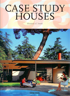
My Shulman and Buff & Hensman bibliographies list 70 publications in all of Case Study House No. 20, the latest being the 2009, 25-Year Anniversary abridged edition of Taschen's Case Study Houses edited by Elizabeth A. T. Smith. (see below).

Published by Taschen, 2009 (from my collection).


Julius Shulman's first assignment for Buff, Straub & Hensman, Case Study House No. 20, was definitely a watershed event in the firm's history. It was a harbinger of the recognition and accolades to come resulting from 44 subsequent assignments including Case Study House No. 28 that Shulman performed for the partnership, the last being the 1984 Schultz Residence in Pasadena. These assignments resulted in over 200 articles and 40 covers in a wide variety of publications. The Shulman-BS&H combine netted 60 feature stories and 10 covers in L.A. Times Home Magazine alone. 


One can't help but wonder what fate would have provided the partners if they hadn't hooked up with Shulman on that eventful day in 1957. The same can be said for Pierre Koenig, Albert Frey, Raphael Soriano, Gregory Ain, and yes, even Richard Neutra. We are all the richer and more appreciative of our Southern California architectural history and legacy because they did. (See my related article The Post-War Publicity Partnership of Julius Shulman and Gordon Drake: Gordon Drake for more on Shulman's star-making ability).


Closing Sidebar

Oct. 15, 2005 Tour Brochure (28 pp.), Friends of the Gamble House, Pasadena & Foothill Chapter - AIA, and USC School of Architecture, Julius Shulman Job 2675, Getty Research Institute. (from my collection).


Case Study House No. 20 had fallen into a major state of disrepair over the years as documented by Ethel Buisson and Thomas Billard in their The Presence of the Case Study Houses published in 2004 by Birkhauser. The CHS 20 chapter heading "Sacred Temple, Aged Body" said it all and was backed up by 8 depressing images of the decay. Thankfully, preservation-minded new owners lovingly restored the house to respectability in time for the October 15, 2005 tour celebrating the firm's work. (see catalog above). 


I attended this tour and spent a couple of memorable hours in the house entranced by how evolved a simple post-and-beam grid/framework could become. It was amazing to me how the alternating indoor and outdoor sections and use of glass could elevate the senses. Their addition of the circular design elements in the plywood vaulted ceiling/roof panels and brick fireplace added a new slant to the post-and-beam design vocabulary. That visit cemented this house in my memory bank as my favorite among all of the Case Study Houses. Kudos to the new owners!


Also highly recommended is the Shelly Kappe chapter Calvin Straub (Buff, Straub, and Hensman) in:


Toward a Simpler Way of Life: The Arts & Crafts Architects of California edited by Robert Winter, University of California Press, 1997. (from my collection).


For a compendium on the published work of the firm see my Buff and Hensman: An Annotated Bibliography


For more on the firm go to http://www.buffsmithandhensman.com/


For more on Calvin Straub and his Arizona work go to http://www.modernphoenix.net/straub/calvinstraubarizona.htm


For more on Case Study House No. 20 and Buff, Straub & Hensman visit the blog http://casestudyhouse20.blogspot.com/